|
Accordion Ajax Control
The Accordion Control is a part of the Microsoft Ajax Toolkit. The Accordion Control organizes your content into expandable Panes or Tabs which can be clicked to make the content of that Pane visible while hiding all the others. You can have virtually any HTML content inside the pane.
When used properly, the Accordion control can be a very effective UI element that can not only help you save costly screen real-estate, but will also make your site look more interactive and organized.
In this article we will learn how to use the Accordion Control in our websites, the different properties that can be modified to change the control appearance and the functionality that you can add.
Using the Accordion Control in Your Website
The Accordion control is one of the few independent or stand-alone controls in the Microsoft Ajax Toolkit. By standalone we mean that it does not extend the behavior of any existing ASP.Net control, and is instead implemented independently.
To add the Accordion control to your website begin by installing the Microsoft Ajax Toolkit on your computer, and reference the Microsoft Ajax Toolkit DLL in your project so that the Ajax controls appear in the Controls toolbox.
If you’re using Visual Studio 2008 then you must add a page of the type ‘Ajax Web Page’ in your project. This will automatically put in a reference to the Ajax ScriptManager control in the page, otherwise you can manually add the ScriptManager to the page. Like all Ajax Control in the toolkit, the Accordion control depends on the ScriptManager to run.
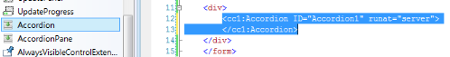
Drop the control on to your webpage by double clicking on the icon in the toolbox, or by dragging and dropping it into the toolbox. I recommend that you drop the control on the page in Source view. It will help you place it accurately
Try shifting to the Design view now. Notice that nothing is visible on the design view yet. That is because the Accordion Control is a Container control. The control will display only content that’s placed in an Accordion Pane inside it.
Let’s see the full code for an Accordion control with two panes in it, and analyze the code bits.
<cc1:Accordion ID="Accordion2" runat="server" SelectedIndex="0">
<Panes>
<cc1:AccordionPane ID="AccordionPane1" runat="server">
<Header>
Heading
</Header>
<Content>
Content
</Content>
</cc1:AccordionPane>
<cc1:AccordionPane ID="AccordionPane2" runat="server">
<Header>
Heading
</Header>
<Content>
Content
</Content>
</cc1:AccordionPane>
</Panes>
</cc1:Accordion>
This is the bare minimum code required to display an Accordion control on a page. Quite a bit isn’t it? And the display you’ll get out of it isn’t anything useful.
To make it look pretty we have to work a little more. But before that, let’s understand how the Accordion control works.
Components of Ajax Accordion Control
Panes – The Accordion Panes must be placed inside the Panes tag. If you do not place the Accordion Panes in the Panes tag, they will not be recognized.
Accordion Pane – This is the control which will hold the content of the panes. You can have multiple Accordion Panes inside the Accordion control.
The Accordion Pane control is divided into two parts, the Content and the Header. The Header is the part that will be displayed for all the Panes, while the Content will be displayed only for the active Pane. If you click on the header of some other pane, the active content will be hidden, and the content of that pane will animate into view.
SelectedIndex – This is a property of the Accordion control. It is used to mark which Accordion Pane will be have its Content visible when the page is first loaded. It’s a 0 based collection.
Remember that each Accordion Pane in the Accordion control will have its own ID. This is to allow you to control the Accordion Pane in code.
Enhancing the Look of the Control
In its present state the control is useless even though it animates the panes because it looks very unimpressive. Fortunately the Accordion control supports CSS styling, and you can specify how you want the Accordion control to look with a few settings. Here are the properties that you can use to set the CSS classes for the Accordion.
ContentCssClass – Styling for the material which is inside the Content portion of the Accordion Panes.
HeaderCssClass – Styling information for the header part of the Accordion Panes.
HeaderSelectedCssClass – You can specify different CSS settings in this property if you want the selected CSS header to look different.
We have created two Sample CSS classes for our Accordion.
<style>
.AccodionHeader
{
background-color: Blue;
color: Yellow;
border: solid 1px green;
}
.AccordionContent
{
background-color: Yellow;
color: brown;
font-size: 12px;
font-family: Verdana, Arial, Helvetica;
}
</style>
This is how the accordion pane looks when the settings are applied.
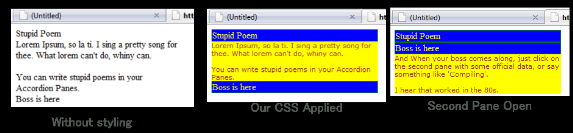
Notice the difference between the version with stylesheets? We have set up only the background and foreground colors, and it’s looking much more organized than the original version. Though we’ve selected rather garish colors, you can pick any color scheme you want and make this look really attractive.
You can highlight the header of the selected Pane by setting the CSS property for HeaderSelectedCssClass.
If you’re not in mood to write CSS, you can also exercise limited control over the appearance using AccordionPane properties like BackColor, Font-Name, Font-Size, etc., but I really do recommend using CSS for this because it will give you much better control over things.
Some More Properties of the Accordion
Here are some more properties of the Accordion Pane that you can set to modify the behavior of the Accordion control.
FadeTransitions – If you set this property to true, the Panes will change with a fade effect when the header is clicked. I.e. the pane going out of view will fade out as it animates. Pretty neat.
FramesPerSecond – This decides how smooth the animation is. Usually this should be set to around 35-45. Keep it too low and the animation will be jerky. Keep it too high and the computer may not be able to render it well if it’s a slow computer.
TransitionDuration – The length of the animation in milliseconds. A length of 1000 means 1 second.
RequireOpenedPane – If this property is set to true, at least one of the panes will be required to be open.
Binding Accordion to a DataSource
The Ajax Accordion is a Data aware control. This means that you can bind it to a data source. The data source can be a collection, or a DataSet that’s drawn from a database. To do data binding, you must set the HeaderTemplate, and the ContentTemplate to setup the data. In this case you will not have any Accordion Panes in the control as they will be generated on the runtime.
You can use any Data Aware control inside the Accordion including labels, text boxes, or even datagrids.
Accordion in Code-Behind
Like all standard ASP.Net controls, Accordions can be controlled from the code-behind too. Though it’s primarily a container control, so you wouldn’t have many situations in which you would want to do this.
You can place any standard ASP.Net control inside the Accordion and use it in Code-Behind. You can also attach events to the controls and process them.
Let’s learn how we can make some real good Ajax magic happen inside the Accordion.
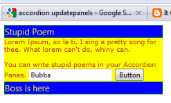
Let’s drop an ASP.Net textbox inside our Accordion control, and let’s drop a button to change the textbox content. Here’s how our Ajax control looks now.
Now if we were to change the text of the Textbox in the Clicked event of the button, we would write the code like this:
protected void Page_Load(object sender, EventArgs e)
{
TextBox1.Text = "Gubba";
}
Try clicking the button after writing this code. Notice the refresh? Yep. If you write code for ASP.Net controls the controls will post-back when the event occurs and you will still have to endure that pesky refresh.
Luckily there is a workaround, another control from the Ajax Toolkit. Just put your Accordion control inside an UpdatePanel and everything will work without a Postback. Here’s how to write this code.
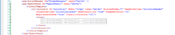
Let’s go back to our code-behind module and get even more radical. Have a look at the following code.
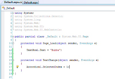
Yes, if the Accordion is inside an Updatepanel you can even change the visible Pane of the Accordion control itself. This is very useful if you want to have a button that changes the Accordion Pane from outside. Unfortunately it will not animate the way it animates when the header is clicked.
Conclusion
This concludes our tutorial of the Microsoft Ajax Accordion Control.
One important thing to remember is that the Accordion control pre-loads all of the data that’s in the panes when the page first shows up. So if you have a lot of data, all of it will be loaded before the page renders. If you put too much material in the Accordion, the page will take longer to load.
Don’t use the Accordion as an alternative for complete Pages, instead use it as an attractive UI element that spices up the look of your page, and makes it more interesting. I am sure you have seen Accordion like behavior on many websites, and can figure out where to make them look best.
|